Color Theory Explained
“Color theory is the intricate roadmap of the visual world, guiding the interplay of hues, shades, tints, and tones to create captivating compositions that evoke emotions, convey messages, and captivate the beholder’s gaze with an artful blend of science and creativity.”
- Meaning and Historical Part
- Let's dive into colors and explore how it works
- What is Color ?
- What is a Color wheel ?
- How Many Colors Are There?
- Importance of Understanding Color Models
- Exploring Color Spaces
- Grayscale
- Color Temprature
- Color Value
- Color Harmonies
- Color Perception
- Tools for Color Measurement
- Color Data Analysis Techniques
- Color Making: The Basic And Advanced
- Guise Garner's Perspective
- FAQs
- Disclaimer
Meaning and Historical Part
“Color theory is a body of practical guidance to color mixing and the visual effects of a specific color combination. It is used in various disciplines such as art, design, and science to understand how colors interact with each other, how they can be combined to create pleasing or effective color schemes, and affect the perception of an object or image.”
Here we can understand the time frame by founders and researchers for colors from history.
Key Contributors to Color Theory:
- Sir Isaac Newton (1642-1727):
- Conducted experiments with prisms, demonstrating the spectrum of colors in white light.
- Developed the first color wheel and published findings in “Opticks” in 1704.
- Johann Wolfgang von Goethe (1749-1832):
- Wrote “Theory of Colours” in 1810, challenging Newton’s ideas.
- Introduced the psychological aspect of colors, emphasizing their effects on emotions and moods.
- Albert Munsell (1858-1918):
- Created the Munsell color system in 1905, organizing colors based on hue, value, and chroma.
- Introduced the concept of a three-dimensional color space.
- Johannes Itten (1888-1967):
- A key figure in the Bauhaus movement, he taught color theory emphasizing color harmony.
- Developed the twelve-part color wheel and theories on contrast and harmony.
- Josef Albers (1888-1976):
- Student and later teacher at the Bauhaus, known for his work on color interactions and optical illusions.
- Published “Interaction of Color” in 1963, exploring the perception of color.
(*Information source Google, Wikipedia and other Historical websites*)
Evolution of Color Theory:
- Ancient Theories: Color symbolism and theories existed in ancient cultures such as Egypt and China.
- Renaissance: Artists like Leonardo da Vinci studied color properties, leading to the development of color mixing techniques.
- 18th-19th Century: Scientists like Thomas Young and Hermann von Helmholtz contributed to color perception and the trichromatic theory.
- Modern Era: The 20th century saw the development of various color models, systems, and theories.
While Sir Isaac Newton’s experiments with light and prisms were foundational, color theory as a comprehensive field has evolved through the contributions of multiple thinkers over centuries. Each of the key figures mentioned above played a significant role in shaping our understanding of color, from its scientific properties to its psychological and artistic aspects.
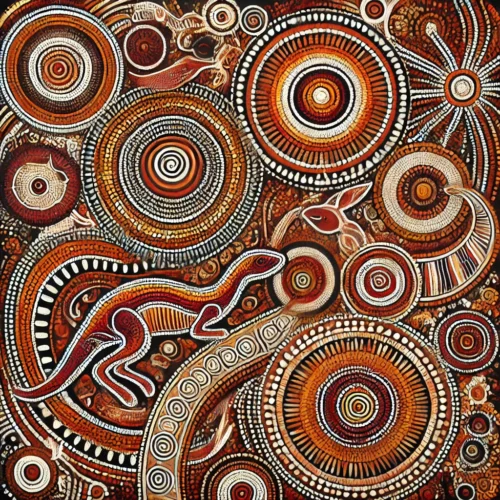
India’s (Bharat) contribution to color theory
India (Bharat) consider to be most colorful country in world. It’s contribution to color theory is both rich and profound, deeply rooted in its vibrant culture and ancient traditions. Here’s a concise yet analytical look at how India’s color symbolism and practices have influenced the broader understanding of color:
Cultural Significance and Symbolism:
- Colorful Textiles: India’s renowned textiles, such as saris, are not just visually stunning but also deeply symbolic. Each color carries specific meanings tied to cultural beliefs and occasions.
- Festivals and Rituals: Color plays a central role in Indian festivals like Holi, Diwali, and Navratri. Holi, the Festival of Colors, symbolizes the arrival of spring and the triumph of good over evil through the joyous throwing of colored powders.
- Spiritual Depth: Colors hold spiritual significance in India. Saffron (orange) signifies renunciation, white represents purity and peace, red symbolizes fertility and prosperity, and yellow is associated with knowledge and learning.
Traditional Color Theory:
- Ayurvedic Wisdom: In Ayurveda, colors are linked to the body’s energy centers or chakras. Specific colors are believed to balance and heal these energy centers, influencing both physical and mental well-being.
- Vastu Shastra Influence: The traditional Indian architectural system of Vastu Shastra considers colors essential for creating harmonious living spaces. Different colors are used strategically to enhance specific energies in various rooms.
Artistic Heritage:
- Indian Miniature Painting: This art form showcases a rich array of colors derived from natural sources like minerals and plants. These paintings often depict mythological stories and daily life scenes with intricate color schemes.
- Mughal Aesthetics: The Mughal Empire’s art and architecture in India incorporated a wide spectrum of colors. Mughal gardens, for instance, were meticulously designed with specific color schemes to evoke beauty and tranquility.
Contemporary Influence:
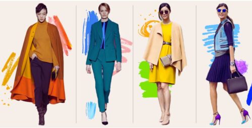
- Fashion and Textiles: Indian designers continue to draw inspiration from the country’s vibrant color palette. Bold hues and intricate patterns are prevalent in both traditional and modern Indian fashion, showcasing a blend of heritage and contemporary style.
- Craftsmanship: India’s traditional crafts, such as block printing and embroidery, display a mastery of color mixing and harmony. These crafts reflect a deep understanding of colors’ emotional and visual impact.
Analysis and Integration:
- Design Inspiration: Incorporating India’s colorful traditions can add depth and meaning to fashion designs. Understanding the symbolism behind colors can create garments with cultural resonance.
- Content Creation: Exploring India’s color theory can inspire engaging content for your website and social media platforms. Discussing the significance of colors in Indian culture can resonate with your audience, fostering a deeper connection.
By integrating India’s vibrant color heritage into your work, you can create designs and content that not only captivate but also tell stories of culture and tradition.
Let’s dive into colors and explore how it works
Color theory delves into various technical aspects, starting with primary, secondary, and tertiary colors forming the basis of the color wheel. Understanding hue, saturation, and value is crucial, along with the principles of color spaces and models like RGB and CMYK. Perception, psychology, and symbolism explore cultural and emotional aspects. Harmony, schemes, contrast, grayscale, temperature, neutrals, achromatic, Color Data Analysis Techniques and Tools for Color Measurement further enrich the understanding and Making of colors.
What is Color ?
Color is a visual perception produced by light within the visible spectrum. It’s one of the most fundamental elements of art, design, and our everyday lives. Here’s a breakdown of what color is and how it works:
“Color is the characteristic of an object or substance that is determined by the wavelengths of light it reflects or emits.“
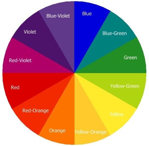
What is a Color wheel ?
A color wheel is a visual representation of colors organized in a circular format. It’s a tool used by artists, designers, and anyone working with colors to understand color relationships, harmonies, combinations etc. The color wheel typically consists of primary, secondary, and tertiary colors arranged in a circular manner.
How Many Colors Are There?
Color has endless possibilities of range. The topic of the number of colors is intriguing and multifaceted. In the visible light spectrum, there’s a continuous range, yet humans discern distinct colors. The inquiry into how many colors exist traverses physics, biology, culture, and art. While humans perceive millions, their categorization and naming vary greatly. From the primary hues of light to the abundant tones in nature, color’s diversity ignites creativity and exploration. Each color carries its own significance, eliciting unique emotions and perceptions within individuals and cultures. Ultimately, color goes beyond mere sight, offering a vast canvas for artistic expression and scientific investigation.
Here we can understand colors by these explored categories:
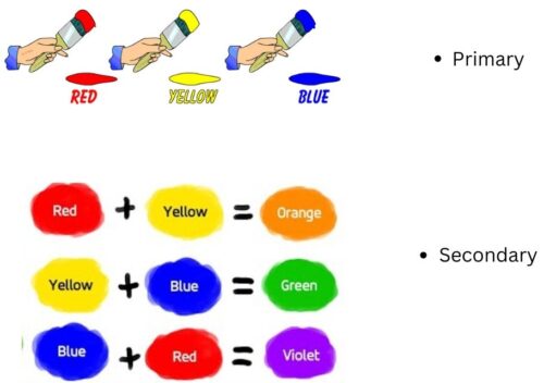
Primary Colors:
- Red
- Blue
- Yellow
Secondary Colors (Mixing Primary Colors):
- Red + Blue = Purple
- Blue + Yellow = Green
- Yellow + Red = Orange
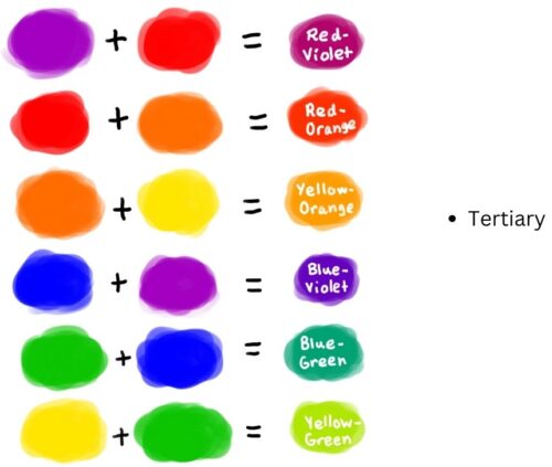
Tertiary Colors (Mixing Primary and Secondary Colors):
The alternative names of the tertiary colors are:
- Red-orange (vermilion)
- Yellow-orange (amber)
- Yellow-green (chartreuse)
- Blue-green (teal)
- Blue-violet (indigo)
- Red-violet ( magenta or purplish-red)
Additionally, after the basics, there are the following colors.
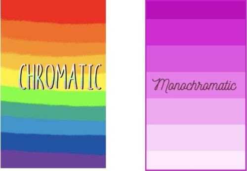
Chromatic Colors
Chromatic color refers to colors that have hue, meaning they are distinct colors on the color wheel. These are the colors we typically think of when we think of the spectrum: red, blue, green, purple, etc. In other words, any color that is not a shade of gray (achromatic) is considered chromatic. Chromatic colors are the vibrant, distinct hues that we see in everyday life, and they form the basis of color theory and artistic compositions.
Monochromatic colors
Monochromatic colors are a set of colors derived from a single hue (or base color). In other words, they are variations in lightness and saturation of a single color. A monochromatic color scheme typically involves using different shades, tints, and tones of one color, creating a cohesive and harmonious look. This approach is often used in design and art to achieve simplicity, elegance, and a sense of unity while still allowing for visual interest and depth.
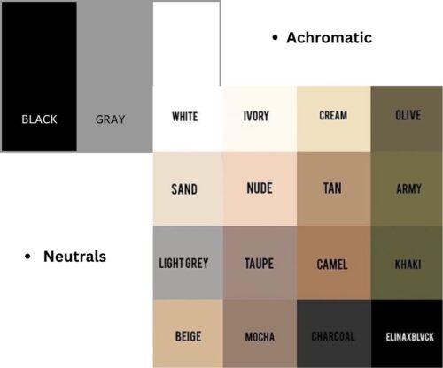
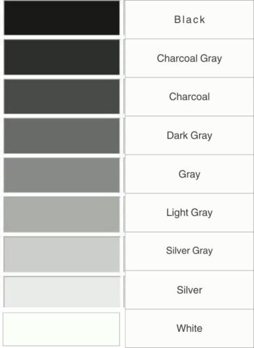
Achromatic Colors
Achromatic colors are colors without hue, meaning they do not possess any specific color or wavelength. Neutral in nature, not leaning towards any particular color family. Lack of distinct color temperature. Achromatic colors, like black and white, offer strong design contrast, symbolizing elegance and timelessness. They’re essential in graphic design, fashion, photography, and interiors. They are :
- Black: Represents power, formality, and sophistication.
- White: Symbolizes purity, cleanliness, and simplicity.
- Gray: Represents neutrality, balance, and versatility.
Neutral Colors
In the context of colors, “neutral” refers to shades that are not on the traditional color wheel. These colors are often created by mixing complementary colors or by adding black or white to a hue. They are versatile and can work well with many other colors, serving as a base or background in design. Neutrals may have variation as per temparture and other terms of color.
Neutral colors include tones like black, white, gray, beige, taupe, and cream…refer below.
Importance of Understanding Color Models
Color models are mathematical models that describe the way colors can be represented and displayed. They provide a systematic way to define colors using numbers or coordinates. Different color models are used for various applications, from digital imaging to design to color printing. Here are some common color models:
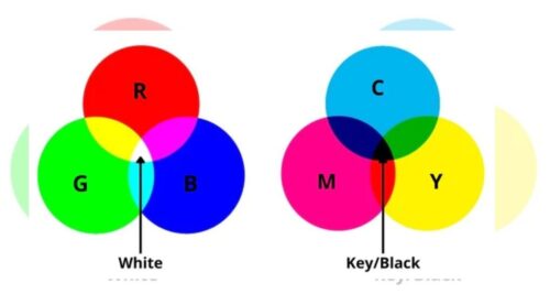
RGB (Red, Green, Blue)
In the digital world, RGB is the most commonly used color model. It represents colors as combinations of red, green, and blue light. Each color is defined by a value ranging from 0 to 255 for each primary color, allowing for a wide range of color possibilities. For example, when all three colors are mixed at full intensity, they create white light. On the other hand, when all colors are absent, it results in black colors (no light shining, RGB:0, 0, 0).
CMYK (Cyan, Magenta, Yellow, Key/Black)
In contrast to the RGB model, which starts with black and adds light, the CMYK model begins with white and subtracts color. In CMYK, colors are achieved by subtracting varying amounts of cyan, magenta, yellow, and black ink from a white background. When these four ink colors are combined, they create a full spectrum of colors. For example, when all colors are mixed at full intensity, they absorb all light, resulting in a black color. This is referred to as the “key” or “K” color.
However, if cyan, magenta, and yellow are mixed together, the resulting color would not be sufficiently dark or opaque to create true blacks. Printers use these four colors in varying combinations to reproduce a wide range of colors. Understanding CMYK is essential for designers working on print projects.
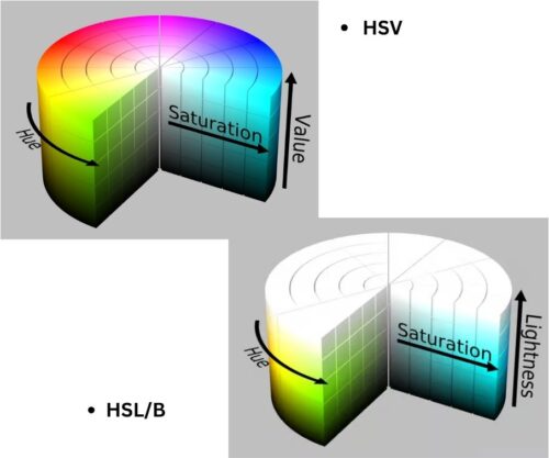
HSL/HSV (Hue, Saturation, Lightness/Value)
HSL (Hue, Saturation, Lightness) and HSV (Hue, Saturation, Value) are two color models used in digital imaging, computer graphics, and color representation. Here’s an explanation of each component:
HSL (Hue, Saturation, Lightness):
- Hue: This is the actual color of the pixel, represented as a degree on the color wheel (ranging from 0 to 360). It defines the “type” of color, like red, blue, green, etc.
- Saturation: Saturation refers to the intensity or purity of the color. A saturation value of 0% results in grayscale (no color), while 100% saturation is the purest form of the color.
- Lightness: Lightness represents how bright or dark the color is. A value of 0% is black, 100% is white, and 50% is the “normal” color without any additional lightness or darkness.
HSV (Hue, Saturation, Value):
- Hue: Similar to HSL, hue is the type of color, represented as a degree on the color wheel.
- Saturation: Saturation in HSV also refers to the intensity or purity of the color. A saturation value of 0% results in grayscale, and 100% saturation is the purest form of the color.
- Value: Value represents the brightness of the color. It ranges from 0 to 100%, where 0% is black and 100% is the brightest possible color.
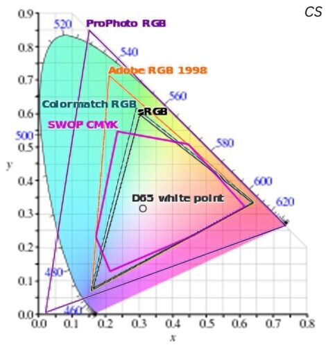
Exploring Color Spaces
Color spaces are mathematical models that describe the way colors can be represented as tuples of numbers. They provide a standardized way to communicate and reproduce colors in various applications like digital imaging, photography, printing, and graphic design. Different color spaces are designed for specific purposes, each with its own range of colors and mathematical representation.
CIE XYZ
The International Commission on Illumination (CIE) created the standardized model known as the CIE XYZ color space. It serves as a reference for defining colors in various industries, including fashion and design.
Lab (CIELAB)
Color scientists and professionals widely use Lab color space, also known as CIELAB, to approximate human vision and its applications in color science and color management. It consists of three parameters: L for lightness, a for the position between red/magenta and green, and b for the position between yellow and blue.
Luminance and chrominance
This color space is utilized in color television standards like NTSC, PAL, and SECAM, among others. Examples include YIQ, YUV, YDbDr, YPbPr, and YCbCr. These systems combine two color values with one brightness value, providing a comprehensive representation of colors on screen. Additionally, a newer extended color space called xvYCC is used for digital video signals, expanding the range of colors that can be displayed.
Grayscale
Grayscale images basically consist of achromatic colors; shades of gray, ranging from black to white, without any color. Each pixel in a grayscale image is assigned a color value representing its brightness. Widely used in photography, design, and medical imaging, grayscale offers simplicity, strong contrast, and efficient data storage. It simplifies images by removing color distractions, focusing on textures and shapes. Adding any hue to grayscale creates shades of color.
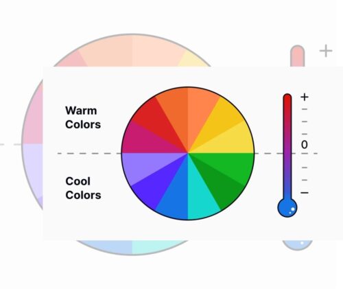
Color Temprature
Temperature in color refers to the warmth or coolness of a color. It’s a characteristic that can evoke certain feelings or associations. Warm colors often associate heat, energy, and passion, while cool colors link to calmness, serenity, and tranquility. Types:
- Warm Colors:
- Warm colors tend to have a red, orange, or yellow undertone.
- They evoke feelings of warmth, energy, and vibrancy.
- Cool Colors:
- Cool colors have a blue, green, or purple undertone.
- They create a sense of calmness, relaxation, and serenity.
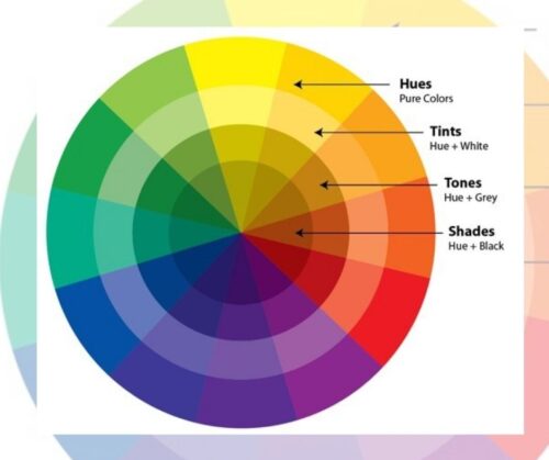
Color Value
Color value, also known as tone, refers to the lightness or darkness of a color. Lighter colors have a higher value, closer to white, while darker colors have a lower value, closer to black. Value changes in the following ways:
- Tint: Adding white to a color creates a lighter value.
- Shade: Adding black to a color creates a darker value.
- Tone: Adding gray to a color creates an overall value.
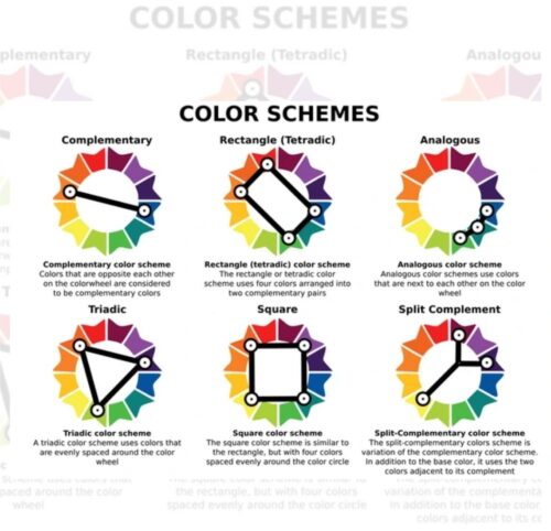
Color Harmonies
Color harmonies are a fundamental aspect of art and design, defining how colors interact and complement each other to create visually pleasing compositions. They are combinations of colors that work well together, enhancing the overall aesthetic and impact of a piece. They also can be consider as Color Scheme.
Variety of Color Harmonies and Schemes
- Analogous: Colors that are adjacent to each other on the color wheel, creating a harmonious and unified look.
- Complementary: Colors that are opposite each other on the color wheel, providing strong contrast and vibrancy.
- Triadic: Three colors evenly spaced on the color wheel create a balanced and dynamic palette.
- Split-Complementary: A variation of complementary colors, using one base color and two colors adjacent to its complement.
- Tetradic (Double-Complementary): Two pairs of complementary colors, offering rich and diverse color schemes.
- Square Colors: Four colors evenly spaced around the color wheel, forming a square or rectangle.
- Monochromatic color: This refers to a color scheme that uses variations of a single color. Different shades, tints, and tones of a single color use without any other colors. This creates a harmonious and cohesive look while still providing contrast and visual interest.
The given image explain how it looks and what makes it Harmonies:
Color Perception
Color perception is the process by which our eyes and brain interpret the wavelengths of light that enter our eyes. It involves both physiological and psychological factors. Physiologically, the retina in our eyes contains rods and cones, with cones being responsible for detecting color. There are three types of cones – S-cones for blue light, M-cones for green light, and L-cones for red light. These cones work together to create the perception of different colors.
Psychologically, color perception is influenced by various factors:
- Color Constancy: This refers to our ability to perceive colors consistently under different lighting conditions.
- Cultural Influences: Different cultures may associate different meanings and emotions with colors.
- Emotional Responses: Colors can evoke emotional responses, such as calmness with blue or excitement with red.
- Personal Experiences: Our individual experiences and memories can affect how we perceive colors.
Color blindness is a condition where individuals have difficulty distinguishing certain colors, often due to a deficiency or absence of one or more types of cones in the retina. Red-green color blindness is the most common type.
Tools for Color Measurement
Spectrophotometers
Sophisticated devices like spectrophotometers, measure the intensity of light across different wavelengths. In the fashion and textile industries, they are crucial for ensuring accurate color matching and consistency in dyeing and printing processes.
Colorimeters
Colorimeters offer a simplified approach to color measurement. In textile manufacturing, they commonly use them to check fabric colors and maintain consistency across production batches. Colorimeters provide RGB or CMYK values, making them ideal for digital color applications.
Swatch Libraries
Swatch libraries are collections of physical fabric samples representing different colors and textures. Designers use these libraries as references for selecting colors for their collections. Each swatch associates color data, such as RGB/CMYK values and fabric composition.
Color Data Analysis Techniques
Color Matching Algorithms
Matching algorithms compare color data from different sources to ensure consistency. They are vital in fabric production, where maintaining color consistency across dye lots is crucial. These algorithms analyze datasets to find the best color matches within predefined tolerances.
Statistical Analysis
Statistical analysis is used to identify trends and patterns in color data. By examining historical data and market trends, designers can predict future color trends and consumer preferences. Regression analysis and clustering algorithms are commonly used for this purpose.
Color Trend Forecasting
Color trend forecasting combines data analysis with market research and cultural influences to predict future color trends. For fashion designers, this means staying ahead of the curve and creating collections that resonate with consumers. By leveraging color data, designers can anticipate which colors will be popular in upcoming seasons.
Color Making: The Basic And Advanced
Colors are made through the interaction of light and objects. Light is either absorbed or reflected by objects, and pigments in objects selectively absorb and reflect light to create color. Mixing colored lights or pigments follows different rules (additive vs. subtractive). Different color models like RGB and CMYK are used in various applications like art, printing, and technology to create and reproduce colors. Here’s an explanation of how colors are made from a manufacturing perspective, focusing on the process of making, along with a section on the role of technology:
Pigment Production:
- Raw Material Selection: Choose raw materials based on the desired color. This can include minerals, plants, or synthetic chemicals.
- Grinding: Finely grind the selected raw materials into powders to create the pigment. This process ensures uniform particle size for consistent color.
- Mixing Binders: Mix the pigment with binders, such as oil for oil paints or water for watercolors. The binder helps the pigment adhere to surfaces and provides the desired consistency.
Organic Dye Extraction:
- Source Collection: Gather natural sources like plants, insects, or animal products known for their coloring properties.
- Extraction: Extract colors by soaking, boiling, or fermenting the sources in water or solvents to release the dye molecules.
- Purification: Process the extracted colors to remove impurities and obtain a concentrated dye solution. This can involve filtration or chemical treatments.
Synthetic Color Creation:
- Chemical Synthesis: Scientists synthesize new colors by carefully combining different chemicals in precise proportions. This process allows for the creation of a wide range of colors with specific properties.
- Reaction Control: Monitor and control the chemical reactions to achieve the desired color hue, intensity, and stability. This may involve adjusting factors like temperature, pressure, and reaction time.
- Testing: Test the synthesized colors for stability, safety, and consistency. This ensures that the final product meets quality standards and performs as expected.
Paint Production:
- Mixing: Mix the pigments or dyes with appropriate binders to create paint. This step determines the color intensity and texture of the final product.
- Additives: Additives like fillers, stabilizers, and drying agents are incorporated into the paint formulation. These additives enhance properties such as texture, drying time, and durability.
- Quality Control: Ensure color consistency and quality through rigorous testing. This may include color matching, viscosity testing, and performance evaluation under various conditions.
Textile Dyeing:
- Preparation: Prepare the fabric by cleaning and treating it with mordants or fixatives to help the dye adhere.
- Dye Bath: Immerse the fabric into the dye bath, ensuring even coverage. The dye molecules bond with the fabric fibers to impart color.
- Fixation: Apply heat or use chemicals to fix the dye onto the fabric fibers permanently. This step ensures that the color remains vibrant and does not wash out easily.
Technology in Color Making:
With advancements in technology, the process of making colors has become more efficient and precise:
- Color Matching Devices: Spectrophotometers and colorimeters are used to precisely match colors. These devices measure the spectral reflectance of a color and provide accurate color values.
- Computer-Aided Formulation: Software programs allow colorists to formulate colors digitally. They can adjust pigment concentrations and binder ratios to achieve the desired color before physically mixing the materials.
- High-Speed Mixing Equipment: Modern mixers and dispersers can rapidly and thoroughly mix pigments and binders. This ensures uniform distribution of colorants for consistent and high-quality products.
- Automated Quality Control: Automated systems can perform quality control checks on color products. This includes color matching, viscosity measurement, and batch consistency analysis.
- Digital Printing: In the realm of printing, digital technologies have revolutionized color application. Inkjet printers use precise algorithms to deposit ink droplets, creating vibrant and accurate colors on various surfaces.
- Nanotechnology: Nanoparticles are increasingly used in color production. They can enhance color properties such as brightness, durability, and resistance to fading. Nanotechnology also allows for the creation of new color effects like pearlescent and iridescent finishes.
- Artificial Intelligence (AI): AI algorithms are being developed to analyze color trends and preferences. This data helps manufacturers predict market demands and create colors that resonate with consumers.
These technological advancements not only improve the efficiency of color production but also enable the creation of innovative colors and effects that were previously challenging to achieve manually.
This comprehensive process, combined with technological innovations, ensures that colors are manufactured with precision, consistency, and the ability to meet the diverse needs of various industries and applications.
Guise Garner’s Perspective
In conclusion, color theory, from ancient symbolism to modern science, shapes how we perceive and use color. Understanding the cultural and emotional impact of colors allows for designs that resonate with diverse audiences and evoke specific emotions. Applying principles of harmony and contrast in color choices creates visually compelling designs, setting them apart in the dynamic world of fashion. Staying informed about color theory’s historical roots and future trends guides the creation of designs that convey meaning and inspire.
In the colorful realm of fashion and content creation, embracing color theory’s evolution enhances design sensibilities. Infusing deeper meanings through cultural symbolism, evoking emotions with color choices, and creating visually captivating designs with harmony and contrast all contribute to impactful storytelling. With an eye on the past and a vision for the future, color theory becomes a powerful tool for creating designs that connect, resonate, and inspire.
FAQs
1. How does color theory influence fabric selection in fashion design?
Color theory guides fabric selection by helping designers choose colors that evoke specific emotions and messages in their collections. It ensures that fabrics complement each other and create a cohesive overall look.
2. Why is color consistency important in branding?
Color consistency is crucial in branding because it helps customers recognize and remember a brand. Consistent use of colors across branding materials builds brand identity and establishes a strong visual presence in the market.
3. How do colorimeters differ from spectrophotometers?
Colorimeters are simpler devices used for basic color measurement, providing RGB or CMYK values. Spectrophotometers are more advanced and measure light intensity across different wavelengths, offering more precise color data.
4. What role does color data play in digital fabric printing?
Color data is essential in digital fabric printing as it guides printers to achieve accurate and vibrant colors. Printers use RGB or CMYK values to determine the ink combinations needed for each print.
5. How can designers use color trend forecasting in their collections?
Designers can use color trend forecasting to predict upcoming color trends and incorporate them into their collections. This ensures that their designs are on-trend and appeal to current consumer preferences.
Disclaimer
Each and every term mentioned here in this Article have a detailed insight. Color terms may very as per the subjects like fine arts, technologically, scientifically, Historically, psychological, medically etc. The color exploration is being evolved time to time.
This article may have multiple issues. You can help us to improve it or discuss these issues.
This article relies largely or entirely on different or a single source.