Ways to Color Block: Complementary
“Discover the magic of complementary color blocking, where the fusion of opposing shades sparks a visual feast for the senses, inviting you to unleash your imagination and express your unique style with confidence and flair.”
Introduction
Color blocking is a timeless technique that allows individuals to make bold and vibrant fashion statements while showcasing their creativity. One of the most intriguing approaches to color blocking is the use of complementary colors. In this comprehensive guide, we will explore the various ways to effectively utilize complementary colors in color blocking to create stunning visual effects and enhance design aesthetics.
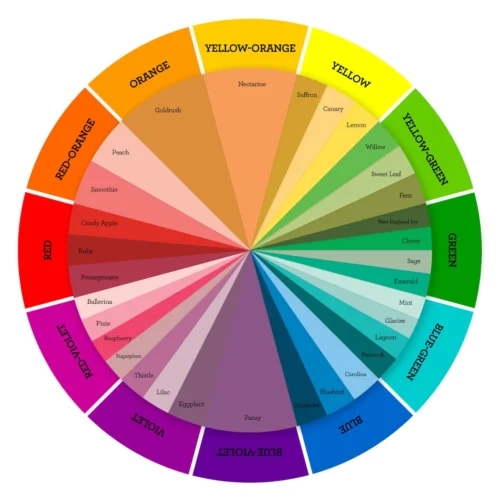
Here’s a list of complementary color pairs commonly used in art:
- Red and green
- Blue and orange
- Yellow and purple
- Cyan and red-orange
- Magenta and green-yellow
- Violet and yellow-green
- Indigo and yellow-orange
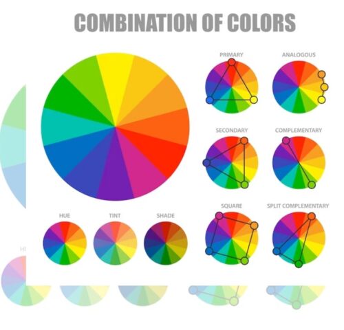
Basics of Color Theory
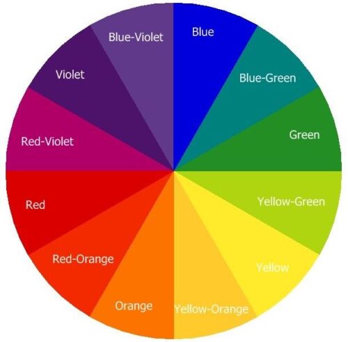
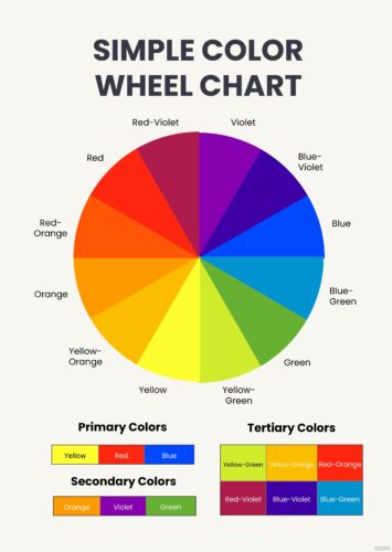
Before delving into complementary color blocking, it’s essential to understand the fundamentals of color theory. Colors are often classified into various categories based on their relationships on the color wheel. Complementary colors are pairs of colors that are located opposite each other on the color wheel, creating a high contrast and vibrant visual effect when used together.
Importance of Complementary Color Blocking
Complementary color blocking plays a crucial role in the world of fashion and design. By strategically pairing complementary colors, designers can evoke strong emotions, create visually appealing compositions, and make bold statements. Whether in clothing, interior design, art, or graphic design, the use of complementary colors can significantly impact the overall aesthetic and appeal of the final product.
Choosing Complementary Colors
Selecting the right combination of complementary colors is essential to achieve harmonious and visually pleasing results. Consider factors such as the mood or atmosphere you want to create, the intended audience, and the specific context in which the colors will be used. Experiment with different combinations to find the perfect balance between contrast and harmony.
The concept of complementary colors is based on the color wheel, which consists of primary colors (red, blue, and yellow), secondary colors (orange, green, and purple), and tertiary colors (mixtures of primary and secondary colors). Complementary colors are pairs of colors that are directly opposite each other on the color wheel. For example, red is complementary to green, blue is complementary to orange, and yellow is complementary to purple.
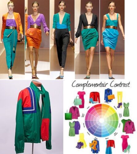
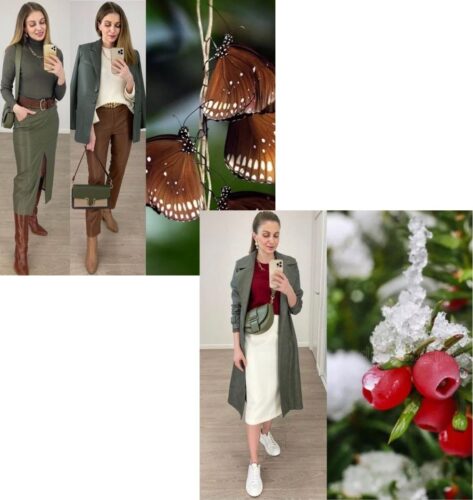
Complementary Color Blocking in Clothing
Complementary color blocking in clothing is a timeless and effective technique that involves pairing colors that are opposite each other on the color wheel. This creates a vibrant and visually striking contrast that can enhance the overall look of an outfit. Understanding how to utilize complementary colors can help you create bold and eye-catching ensembles that stand out.
When it comes to clothing, incorporating complementary color blocking involves selecting garments in contrasting hues and pairing them together to create a visually dynamic look. Here are some tips for effectively using complementary color blocking in your outfits:
Choose the Right Colors:
Start by selecting a dominant color from the complementary pair as the base of your outfit. For example, if you choose blue as your dominant color, you can pair it with orange accents. Experiment with different shades and tones within the complementary pair to find combinations that work well together.
Balance and Proportion:
When combining complementary colors, it’s essential to achieve balance and proportion in your outfit. You can do this by incorporating the colors in equal or varying proportions throughout your ensemble. For instance, if you’re wearing a predominantly blue dress, you can add pops of orange through accessories like shoes, a belt, or a handbag.
Consider Color Intensity:
Pay attention to the intensity of the colors you’re using. Combining bright and vibrant complementary colors can create a bold and energetic look, while pairing muted or pastel tones can result in a more subtle and harmonious effect. Experiment with different intensities to achieve the desired aesthetic.
Mix Patterns and Textures:
Incorporating patterns and textures into your color-blocked outfit can add depth and interest. Consider combining solid-colored garments with printed or textured pieces to create visual contrast and dimension. Just be mindful of not overwhelming the outfit with too many competing elements.
Accessorize Thoughtfully:
Accessories play a crucial role in complementing and enhancing your color-blocked ensemble. Choose accessories in neutral tones or metallics to provide balance and allow the complementary colors to take center stage. Statement jewelry, scarves, and hats can also be used strategically to add visual interest without overpowering the outfit.
Confidence is Key:
Rocking a color-blocked outfit requires confidence and attitude. Embrace the boldness of your ensemble and wear it with pride. When you feel good about what you’re wearing, it shows, and others will take notice.
In terms of future trends, complementary color blocking is likely to remain popular as it offers a versatile and visually impactful way to style outfits. As fashion continues to evolve, we may see new interpretations and innovations in color blocking techniques, such as incorporating digital prints or unconventional color combinations. Additionally, with the growing emphasis on sustainability and eco-conscious fashion, there may be a shift towards using natural dyes and earthy tones in color-blocked outfits.
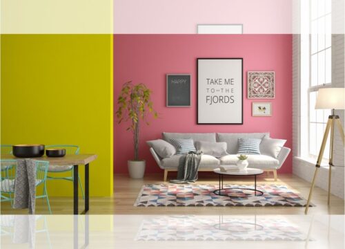
Complementary Color Blocking in Interior Design
In interior design, complementary color blocking can transform any space into a visually stunning environment. Whether you’re decorating a living room, bedroom, or kitchen, incorporating complementary colors can add depth, dimension, and visual interest to the space. Consider using complementary colors for accent walls, furniture pieces, or decorative accessories to create a cohesive and harmonious design scheme.
Selecting Colors:
Start by choosing a dominant color from the complementary pair as the main hue for the room. For example, if you opt for blue as your dominant color, consider pairing it with accents of orange. Experiment with different shades and tones to find the right balance.
Creating Balance:
Achieve balance in the space by incorporating the complementary colors in equal or varying proportions. This can be done through walls, furniture, accessories, and artwork. By distributing the colors strategically, you can ensure a cohesive and visually appealing design.
Enhancing Contrast:
Complementary colors create a strong contrast that draws attention and adds interest to the room. This contrast can be heightened by using varying intensities of the colors, such as pairing a bold, saturated hue with a softer, muted tone.
Adding Depth:
Incorporating complementary color blocking can add depth and dimension to a room. By layering different shades and textures, you can create visual interest and make the space feel more dynamic and inviting.
Accessorizing:
Accessories play a crucial role in complementing the color-blocked design. Choose decor items, such as throw pillows, rugs, curtains, and artwork, that incorporate both complementary colors to tie the room together.
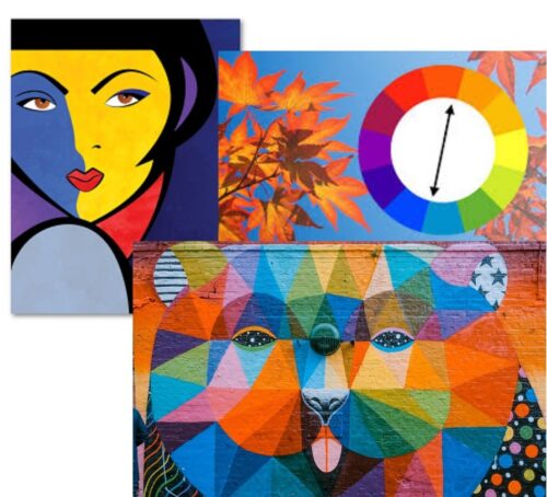
Complementary Color Blocking in Art
Artists have long been fascinated by the use of complementary colors to create dynamic and visually striking compositions. Whether in painting, drawing, or mixed media art, the juxtaposition of complementary colors can add energy, contrast, and excitement to the artwork. Experiment with techniques such as color blocking, blending, or layering to explore the creative possibilities of complementary colors in art.
- Contrast: It creates a strong visual contrast between the colors, making each color appear more vibrant and intense.
- Balance: By using complementary colors, artists can achieve a balanced composition that draws the viewer’s attention.
- Harmony: Despite the contrast, complementary color schemes can also create a sense of harmony when used effectively.
- Impact: This technique is often used to create bold and striking artworks that leave a lasting impression on the viewer.
- Examples: Examples of complementary color pairs include red and green, blue and orange, and yellow and purple.
- Usage: Complementary color blocking can be found in various art forms, including painting, graphic design, and fashion design.
- Effect: It can evoke different emotions and moods depending on the colors chosen and their arrangement.
- Experimentation: Artists often experiment with complementary color blocking to explore different visual effects and create unique artworks.
Complementary Color Blocking in Graphic Design
In the digital realm, complementary color blocking is a powerful tool for creating visually appealing graphics and designs. Whether designing a website, logo, or marketing materials, the strategic use of complementary colors can help capture attention, communicate messages effectively, and enhance brand identity. Experiment with color palettes, typography, and layout to create visually compelling designs that resonate with your audience.
DIY Complementary Color Blocking Projects
For those who love to get hands-on with their creativity, there are countless DIY projects that incorporate complementary color blocking. Whether it’s painting furniture, crafting home decor items, or designing custom clothing, the possibilities are endless. Explore online tutorials, craft blogs, and social media for inspiration and ideas to unleash your inner artist.
Certainly! Here’s a list of DIY Complementary Color Blocking Projects explained briefly in 150 words:
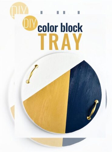
- Color-Blocked Wall Art: Use painter’s tape to create geometric shapes on canvas, then paint each section with complementary colors for striking wall decor.
- Color-Blocked Furniture: Transform a plain dresser or side table by painting alternating drawers or sections with complementary color pairs for a contemporary furniture upgrade.
- Color-Blocked Accessories: Jazz up plain throw pillows or lampshades by painting bold blocks of complementary colors to add visual interest to your space.
- Color-Blocked Clothing: Personalize your wardrobe by color-blocking garments like t-shirts or jeans with complementary hues for a fashion-forward look.
- Color-Blocked Home Decor: Revitalize mundane items like plant pots or storage baskets by painting them with complementary color combinations to add flair to your home.
- Color-Blocked Stationery: Customize notebooks, journals, or folders with strips or blocks of complementary colors to make your stationery stand out.
- Color-Blocked Planters: Spruce up your indoor or outdoor planters by painting different sections with complementary colors to create eye-catching garden decor.
- Color-Blocked Tableware: Elevate your dining experience by painting sections of dishes, cups, or serving trays with complementary color schemes for a chic table setting.
- Color-Blocked Crafts: Get creative with DIY projects like coasters, picture frames, or mobiles by incorporating complementary color blocking techniques for unique handmade items.
- Color-Blocked Accent Walls: Make a statement in any room by painting an accent wall with bold complementary colors to instantly add drama and personality to your space.
These DIY projects allow you to experiment with color and design while creating visually stunning and personalized pieces for your home and wardrobe.
Accessories for Complementary Color Blocking
Accessories play a crucial role in completing any look or design scheme. When it comes to complementary color blocking, carefully chosen accessories can tie the entire ensemble or space together. Consider incorporating statement pieces such as handbags, scarves, throw pillows, or artwork that feature complementary colors to add a pop of color and visual interest.
Psychological Impact of Complementary Colors
The use of complementary colors can have a profound psychological impact on individuals, influencing their emotions, perceptions, and behavior. For example, pairing warm colors such as red and green can evoke feelings of energy and excitement, while combining cool colors such as blue and orange can create a sense of calm and tranquility. Understanding the psychological effects of complementary colors can help designers create more impactful and meaningful experiences for their audience.
Challenges and Solutions
While complementary color blocking offers numerous benefits, it also comes with its own set of challenges. From achieving the right balance of contrast to ensuring color harmony, designers may encounter various obstacles along the way. However, with creativity, experimentation, and attention to detail, these challenges can be overcome to create truly remarkable designs that captivate and inspire.
Here are some challenges you may encounter when working with complementary color blocking, along with potential solutions:
- Color Selection: Choosing the right complementary colors can be tricky and may result in clashing combinations.
- Solution: Use color theory resources or online tools to find harmonious complementary pairs.
- Color Balance: Achieving a balanced composition with complementary colors without overwhelming the senses can be challenging.
- Solution: Start with a neutral base and use complementary colors as accents to avoid overpowering the space.
- Painting Precision: Ensuring clean lines and crisp edges when painting color blocks requires precision.
- Solution: Use painter’s tape to mask off areas and create sharp boundaries for each color block.
- Color Consistency: Maintaining consistent color intensity and tone across multiple surfaces can be difficult.
- Solution: Thoroughly mix paint batches and apply multiple coats to achieve uniformity in color saturation.
- Color Interaction: Complementary colors can intensify each other, potentially causing visual discomfort if not balanced properly.
- Solution: Experiment with different proportions and placement of complementary colors to create a visually pleasing composition.
- Surface Preparation: Preparing surfaces for painting, especially on furniture or walls, can pose challenges in achieving a smooth finish.
- Solution: Sand and prime surfaces before painting to ensure better adhesion and a professional-looking result.
- Color Compatibility: Integrating complementary color blocking with existing decor and furnishings can be challenging.
- Solution: Consider the overall color palette of the space and choose complementary colors that complement rather than clash with the existing scheme.
By addressing these challenges with thoughtful planning and careful execution, you can successfully incorporate complementary color blocking into your design projects with confidence.
Conclusion
In conclusion, complementary color blocking is a versatile and powerful technique that offers endless possibilities for creative expression and design innovation. Whether in fashion, interior design, art, or digital marketing, the strategic use of complementary colors can elevate any project and leave a lasting impression on viewers. By understanding the fundamentals of color theory, experimenting with different combinations, and embracing creativity, designers can harness the full potential of complementary color blocking to create visually stunning and impactful experiences.
FAQs
Q- What are complementary colors?
A-Complementary colors are pairs of colors that are located opposite each other on the color wheel. When used together, they create a high contrast and vibrant visual effect.
Q-How do complementary colors impact design?
A-Complementary colors can add depth, dimension, and visual interest to designs, making them visually appealing and memorable.
Q-Can anyone use complementary color blocking?
A-Yes, complementary color blocking can be used by anyone interested in exploring creative and innovative design techniques.
Q-What are some tips for choosing complementary colors?
A-When choosing complementary colors, consider factors such as the mood, audience, and context of the design to achieve the desired impact.
Q-Are there any challenges associated with complementary color blocking?
A-While complementary color blocking offers numerous benefits, designers may encounter challenges such as achieving the right balance of contrast and ensuring color harmony.
Q-Where can I find inspiration for complementary color blocking projects?
A-You can find inspiration for complementary color blocking projects online, through tutorials, craft blogs, social media, and real-world examples.